A Tale of Two Posters
Poster Design
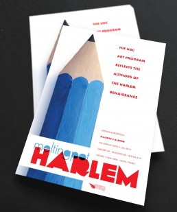
I was recently approached to design a promotional poster for an upcoming exhibition at the University of the District of Columbia. The show is entitled “Melting Pot Harlem” and features art inspired by literary works of the Harlem Renaissance. My brief included instructions to develop two distinct posters, one with visuals that “reflected art & writing in a literal sense” and one that explored “thematic traits of Harlem era literature.” I determined that both posters should echo the design style of the 1920’s but maintain a sense of 21st century modernity.
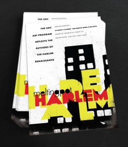
The typographic treatment features two approaches to visualizing the idiom “Melting Pot” without being excessively cliche. For example, the overlay effect points to the coexistence of different cultures and their unique influence on each other. The art deco/ cubist qualities further reinforce a sense of time and each layout provides a positive or negative connotation through their respective color schemes. The upward movement of the painted blue pencil design projects a sense of optimism and is matched by the angularity of the letterforms themselves. The architectural layout however reflects the gritty realism and struggle (both internal & external) that so many minorities of that era faced. Despite their many challenges, the influence of this vibrant culture can be seen in all aspects art, music and literature and continues to inspire generations of people struggling to have their voices heard.
This project was an interesting study in presenting the same information in two completely different contexts and I had a lot of fun exploring the various approaches. My personal preference gravitates towards the emotive and determined qualities of the architectural layout but I find the sincere nature of the blue pencil design to be quite attractive as well. Which approach do you prefer?