Material Typography
Creating typography the “hard way.”
I recently attended a (3 session) class being offered through “Knowledge Commons DC” – a free school for thinkers, doers, and tinkerers – taught anywhere, by anyone, for everyone. The title of the class “Material Typography” was instructed by David Ramos and hosted by the Takoma Park NatureLab. The subject matter explored the unexpected opportunities that arise when typography is taken off of the computer screen and into the physical world. Each lesson offered a wealth of information on designers (contemporary and historic) utilizing creative techniques to achieve unique typographic solutions. Additionally, several in-class exercises provided a deeper understanding how unconventional methods can result in more resonant type. The mantra of the class was “allow yourself to become productively lost” by responding to the limitations and advantages of working with materials that you can touch.
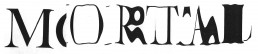
Material Typography: Cardboard Stamps
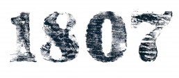
My initial study explored the use of cardboard as a stamp making medium. First, I selected on a sturdy type style that evoked a sense of early 19th century print-making to maximize the distress effect. I then began by cutting the numerals “1807” on a vinyl plotter and adhering them to a cardboard substrate.
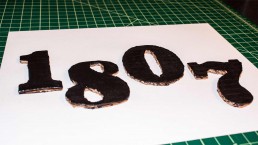
I carefully cut out each numeral with a utility knife and further refined the edges for maximum fidelity. Using 20-lb paper and black acrylic paint, I applied pigment to my stamps and pressed them onto the paper’s surface.
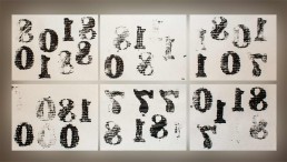
I experimented with applying both small & generous coats of pigment as well as administering varied amounts of pressure to produce diverse results. Finally, I scanned my outcome into the computer and composited the numerals that best fit together. See top image.
Material Typography: Obstructed Scanning
My second study explored the use of obstructing a scanned print with various translucent materials. By placing a translucent material directly onto a scanner bed and then placing printed text atop the translucent material, I was able to “lift” the texture off the material and onto the black portions of the printed paper. The first example (top) utilizes foam wrap, the second uses bubble wrap and the third applies acid etched glass to create a softened edge effect.
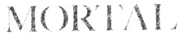
While it’s quite possible to achieve similar textural effects in an image processing program, the point of experimenting in this manner is to discover the possibilities that physical materials can introduce. I really enjoyed this process and found it quite addicting.
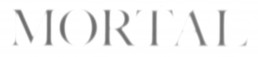
Another technique that I employed was simply moving the printed image around as the image sensor crossed the scanner bed to distort the type. Several interesting images resulted in this process.
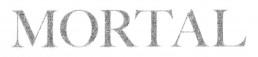
Our assignment was to select a book cover and redesign it using material typography as our focal point. I chose the book “Being Mortal” by Atul Gawande because its subject matter hits particularly close to home. In short, the book chronicles the challenges that Dr. Gawande (and the medical profession as a whole) face in defining the role of medicine for treating patients with incurable diseases.
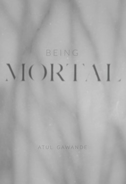
I decided that the of qualities of the etched glass study appropriately reflected the word “Mortal” and suggested the slow process of fading away. To reinforce this softened aesthetic, I photographed marble stone (out of focus) and juxtaposed it against crisp typeset letterforms. The overall aesthetic echoes the duality of the human condition; the physical and mental capacity of the healthy to care for the sick; and the moral and ethical questions that arise from prolonging life.
Overall the Material Typography course at Knowledge Commons DC was an incredibly inspiring experience that provided a bounty of new ideas. I’m looking forward to expanding what I’ve learned and incorporating more material techniques into future designs. Stay tuned for a future post featuring a third study utilizing broken glass!